Lessons in Signage
Ultimately this is a public notice not only to inform the public of proposed street changes but to encourage the public to comment at an assigned time and date.
I was recently in Northern California on vacation with family when I noticed two different public notices. One was in Eureka, California about bicycles and the other was in downtown San Francisco around turns on red. What struck me about both of these seemingly normal notices was their differing marketing tactics. Having worked in marketing for about 5 years now, I can discern what a market asset’s aim is and if it’s accomplishing it. I’d like to analyze these two posters and try to understand their author’s ultimate aim.
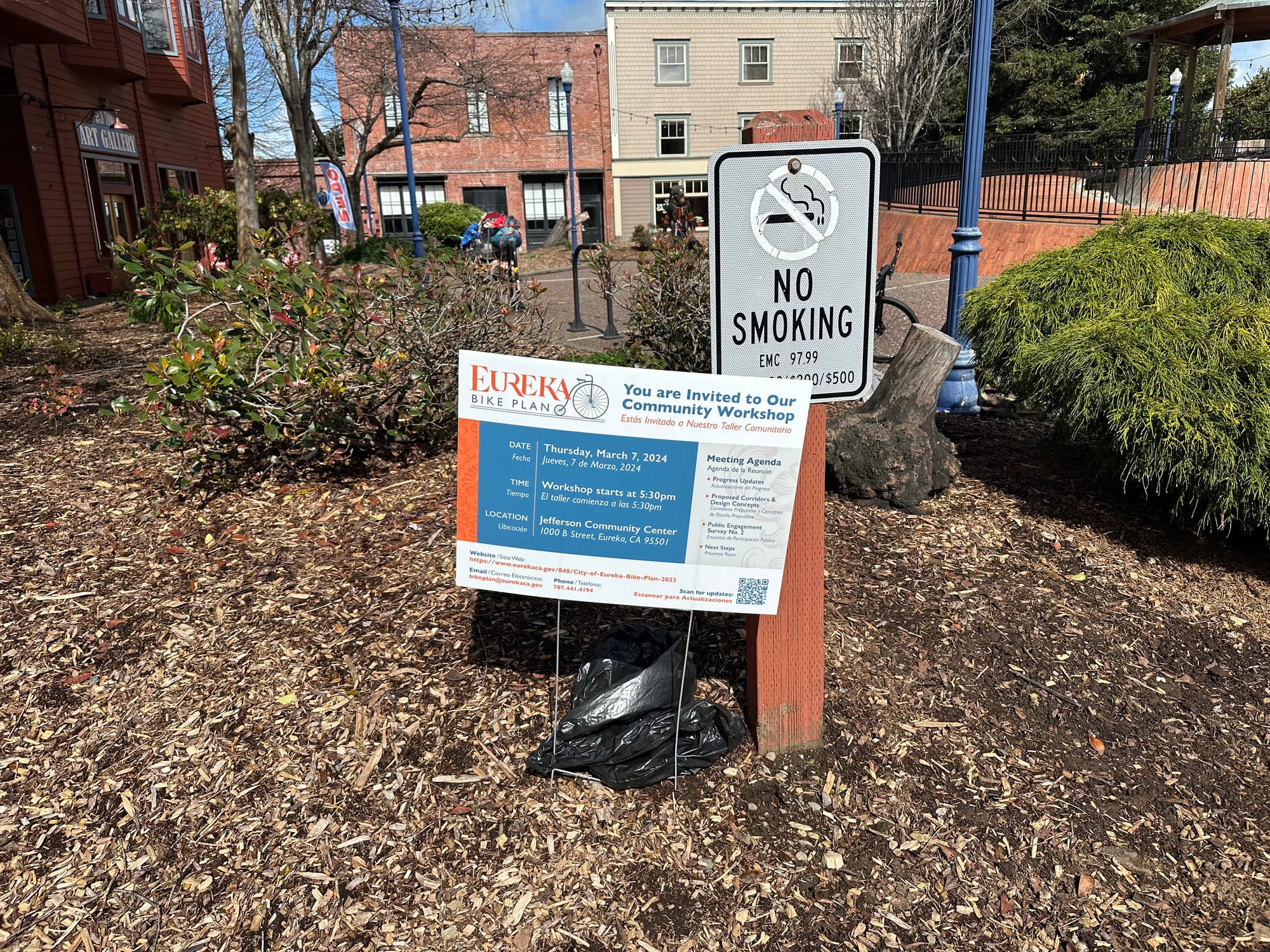
In Eureka, I saw this signage while walking around their old town district. Similar to political signage people stake in their front yards, what immediately caught my eye was the header which included the city logo and bolded text on being invited to a community workshop. The rest of the signage was clear on the who, what, when, and where. Additionally, the fact that the signage had invested in real estate to direct for more information was great - with urls, an email address, a phone number, and a QR code. All extremely clear. Beyond the actual substance of the signage, its style is important to note of being clear and inviting.

Compared to the Eureka public notice the SF poster was on street poles around the Fidi and Chinatown neighborhoods. Regardless of the pole's diameter they slapped the poster on, often leading to the actual letter being hard to read as you had to adjust to the curvature of the pole. Beyond one header text with a vague title “Proposed Street Changes,” the rest is extremely cumbersome to read. In contrast to the design choices of the Eureka notice, nothing about this notice encourages the public to read it. Why is it so long? Why did they print a lengthy memo as a poster? After reading the public notice, I considered the audience as two-fold. Drivers who would no longer be able to turn right on red and the pedestrians/cyclists affected by cars turning right on red. For drivers, this signage is not made for them since it’s not legible when driving past a pole. Where else could SF posted so drivers could be made aware of this proposed change?
I assumed this type of posting would be illegal but found that San Francisco’s Public Works Code has an exception for “signs placed or maintained by the United States Government, the State of California, any department of the City, or Signs posted under the authority of the San Francisco Department of Recreation and Park, the San Francisco Port Commission, or the Department.” This seems a little hypocritical since the spirit of the ruling came from wanting to reduce “the visual pollution caused by such Signs and the resulting contributions to urban blight.”
Ultimately this is a public notice not only to inform the public of proposed street changes but to encourage the public to comment at an assigned time and date. This is where the failure seems particularly harmful. If people don’t know that they have the opportunity to influence policy that shapes their community, they cannot ensure the community landscape is meeting their needs. I think the fundamental question is - does SFMTA want citizens to show up to this hearing? I’ll give them the benefit of the doubt and assume yes. Assuming yes, here are some suggestions I’d make.
SFMTA has funding to print and post these public notices. My recommendation would reallocate this budget. This is where my marketing hat comes on. How can SFMTA’s marketing budget be better used to improve the “funnel”? The top of the funnel is awareness. Where is SFMTA posting this public notice? Is there a place beyond these poles they could be investing in? How can they make sure this information is seen? SFMTA is responsible for multiple public spaces where this notice can be placed - train stations, bus stations, buses themselves, and their own website homepage. The next step in the funnel is interest and consideration. How can they make this notice worthwhile reading? Can they make it more succinct? Can they make it easy to understand? Can they convince people to go to this public hearing? Even with adjustments to just these two stages, I am hopeful that related webpage would get more relevant traffic and in turn more people at the 3/22 hearing.